
|
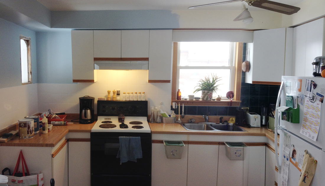
I'm well into my (almost) free kitchen update now, and so far, so good. If this is your first time reading about my crazy project, you can catch up here: With the cabinets down, I have focused on repairing walls and painting. I'm going to start on the half of the kitchen where I've removed the cabinets, and once I have finished all the work on that side of the kitchen, I'll paint the other side of the kitchen. Before painting the walls, I wanted to deal with the forest green monster that is our backsplash. Seriously, I think if we were to do a scale comparison between Fenway Park and my kitchen, the green monster at Fenway would be shrimpy compared to my backsplash. 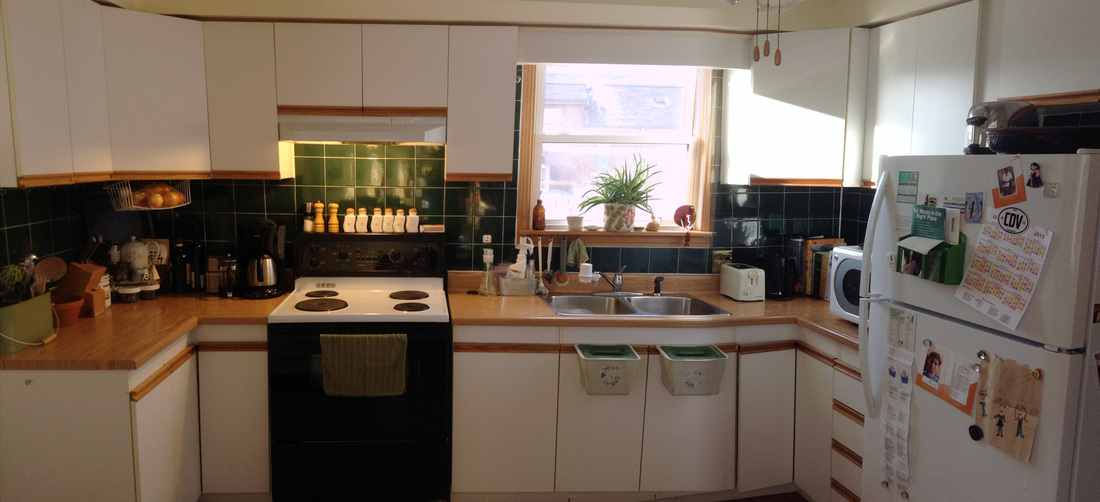
Sheesh.
The first thing I had to do was chip away an extra couple inches of tile that had been installed to meet up with the original cabinets. Taking the entire backsplash down would have created a big mess and a lot of repair work, but I could handle a few inches. So I got out a hammer and chisel and went to town. 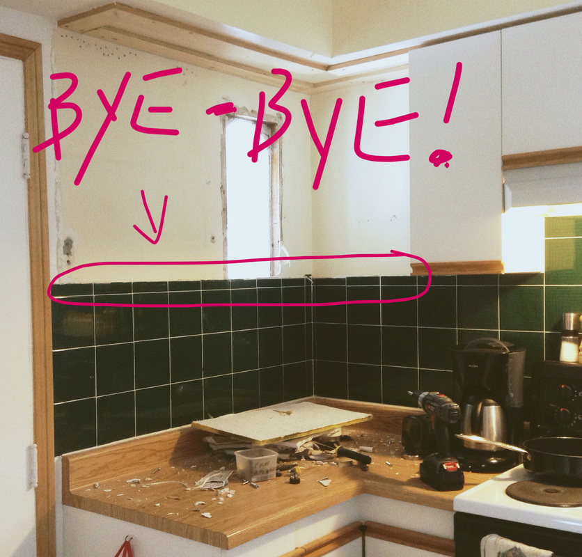
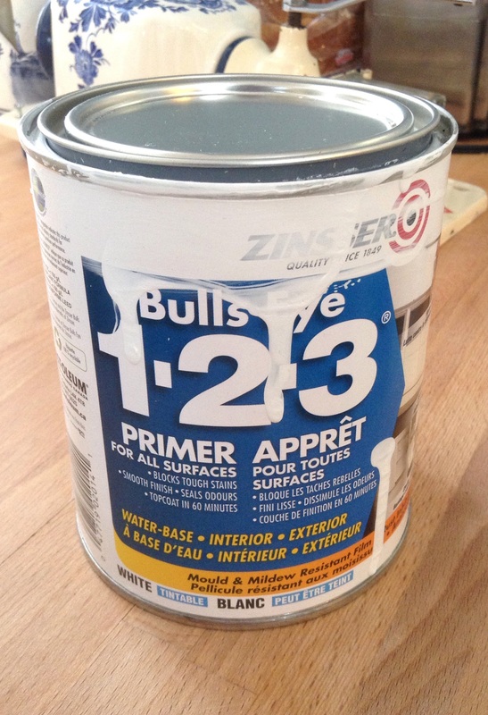
I considered several options for covering up the rest of the backsplash. Pinterest is rife with clever ideas for covering over the tile with materials like barn board, pallet wood, corks, aluminum flashing, and even pennies. These options were either more work or more money than I wanted to commit. One option I seriously explored was to cover the backsplash with off-cuts of bamboo flooring left over from redoing some floors in our upstairs. It would have looked kind of like subway tile. I laid out all the pieces we had - and it looked super cool - but in the end, I just didn't have enough off-cuts to work with. I suppose if I was really determined, I could have found a way to make it work, but I'm not that ambitious. So in the end, I opted for paint. Boring, I know. I kind of feel like I compromised cleverness for convenience. But when it comes down to it, I really want the backsplash to take up less usable space, and paint is probably a good method of accomplishing that. I had some leftover heavy duty white paint in the basement that I could use, but first I needed to invest in a super duper primer that could deal with the glossy surface of ceramic tile. I did some research, and landed on Zinsser Bulls-Eye 1-2-3 Primer for all surfaces.
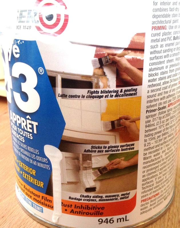
Before painting, I scrubbed down the tile with hot water with soap and vinegar to make sure all the grease was off the tiles. Then, using a foam roller for a super smooth finish, I rolled on two coats of primer, followed by three coats of my leftover white paint. Now, there are a lot of conflicting opinions about the success and effectiveness of painting tile. So I have no guarantee of the longevity and durability of my choice for coverage. But from what I can tell so far, that primer has stuck to the tile with true affection: no peeling away, flaking, or bubbles. I've already wiped splatters of tomato sauce off of the backsplash, and the paint has held up with no problem. 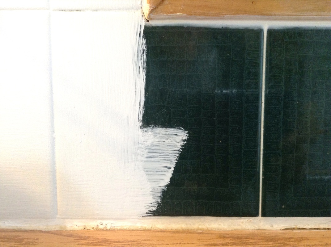
The true test of the paint's durability over the years will be on the backsplash around the stove and sink areas. I'll keep you posted . . . . And now for the walls. I had intended to use more leftover paint on the walls, but Dan weighed in on this one. Most of our downstairs is painted in shades of muted yellow. It's a bit weird, actually. Dan convinced me to shell out some cash for a can of paint so that we could stop the yellow madness and completely change the colour of the kitchen.
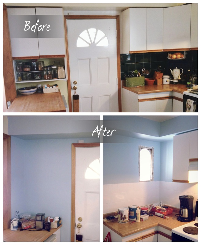
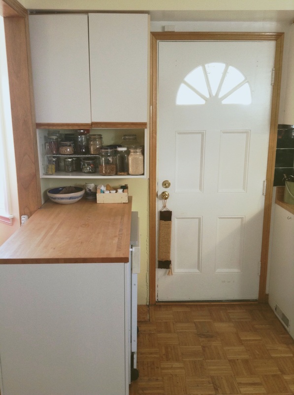
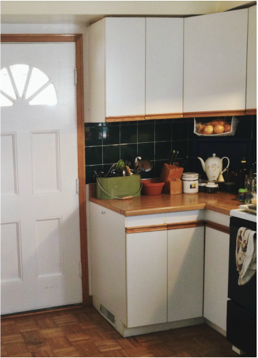
. . . and another before and after (well, half way, anyway) . . . 
Sorry about the mess and the subpar photos.
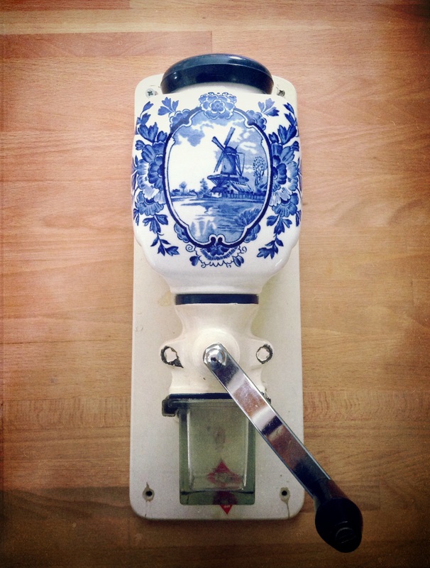
I'm still getting used to the colour. It feels really blue. But I think adding shelves and whatnot will even out the effect a bit. I do love how the white tile and blue walls work together. And the coffee grinder will fit in quite nicely. So now for the budget update on my (almost) free kitchen update . . . The Almost Part (including taxes) $ 13.65 spent to date + 13.55 (Zinsser primer for tiles) + 73.44 (Benjamin Moore paint for walls) $100.64 By now, you might be crying fowl: "Hey, isn't this supposed to be a free update? You haven't done anything free yet, you fraud." Well, just you wait, my friend. The free stuff is coming next. Are you excited? I am.
1 Comment
 I have broken out the power tools (well, a drill) and started my free kitchen update. If you'll recall from myearlier post, the first task I set out for myself was to take down some cabinets along the front wall of our house. One of the cabinets was coming out of the bulkhead into which it was anchored, and the other cabinets covered a window I desperately wanted to uncover. Armed with my drill, I took off all the cupboard doors and then removed all the screws that attached the cabinets to the wall and to each other. For the most part, the cabinets came down pretty easily . . . a little too easily in some cases.
Before we made that change, the cabinet was already sagging a little, but I think we probably made it worse, despite our efforts to reinforce it. I took this photo after I removed the cabinet, and it shows how badly the cabinet had been sagging, probably 3/4" where it met the wall. When I removed the wood after taking this picture, the screw in that corner literally fell out of the bulkhead. 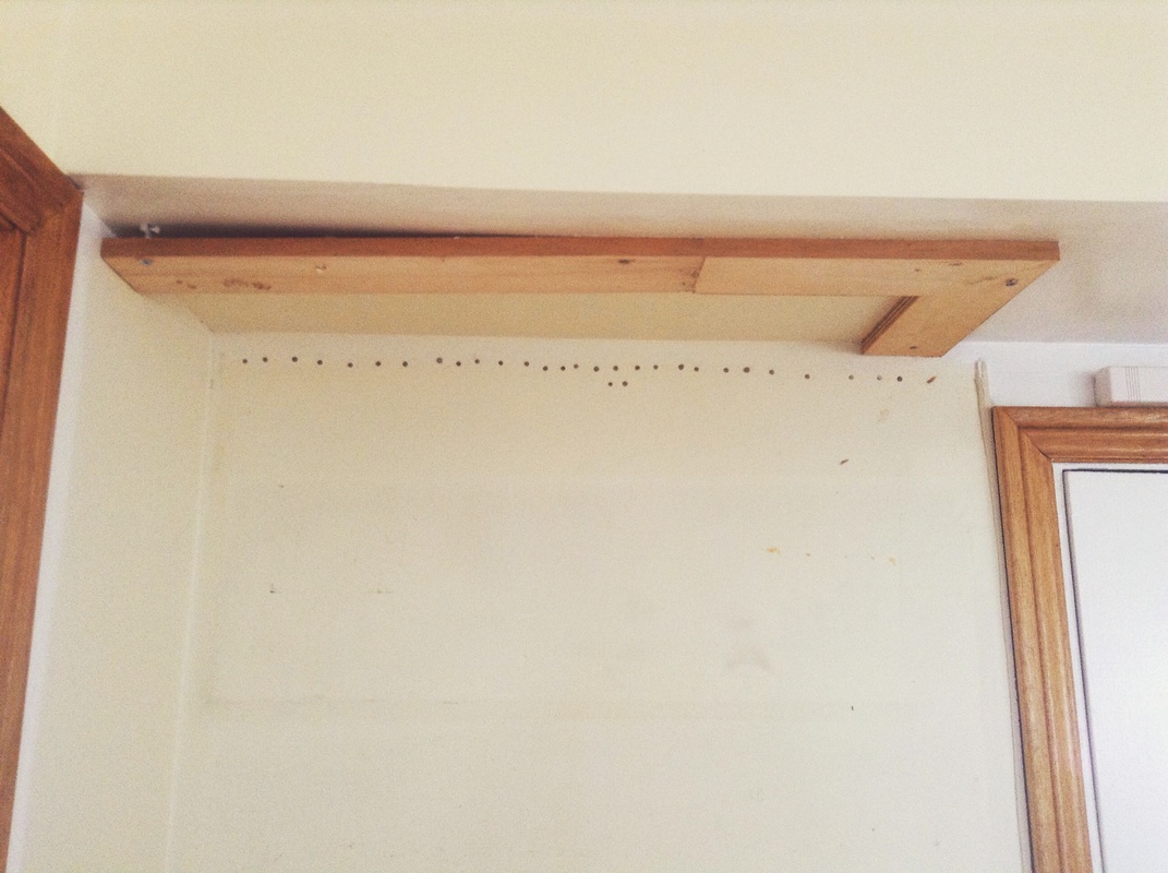 With the cabinet gone, I learned a little more about the curious construction of our kitchen. Besides the screws that Dan and I had added to the cabinet when we cut out the bottom a few years ago, I counted three screws: two in the wood trim thingy on the bulkhead and one in the wall. Yikes. I suppose the original construction of this pantry cabinet was reliant upon the support of the floor. But still . . . three screws? And then there's the wood trim - or whatever - between the cabinet and the bulkhead. I always assumed there was a solid piece of wood there, for aesthetic impact or something - and when I took down the cabinets, I was amused to discover what it really was: 1x4 plywood. I have no idea what purpose it served. Any ideas? Another mystery behind the cabinet was the line of nails at the top of the wall. I have no idea what that's about.
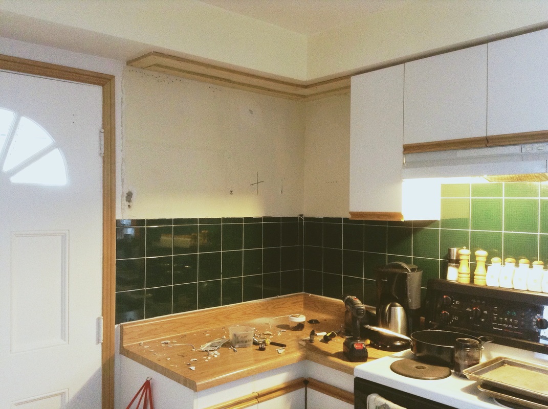 I haven't done the dishes. Too excited to rip out cabinets. . . . sigh. No window, at least not yet. Cracks in the wall gave a clear indication of where the window was hiding - x marks the spot - so I got a drywall knife from our workshop and got to work. Carefully. The drywall in front of the window came away easily and revealed another hilarious discovery: the space between the window and the drywall was insulated with a ceiling tile. Maybe that's a normal contracting hack. In any case, the mystery was finally revealed . . . 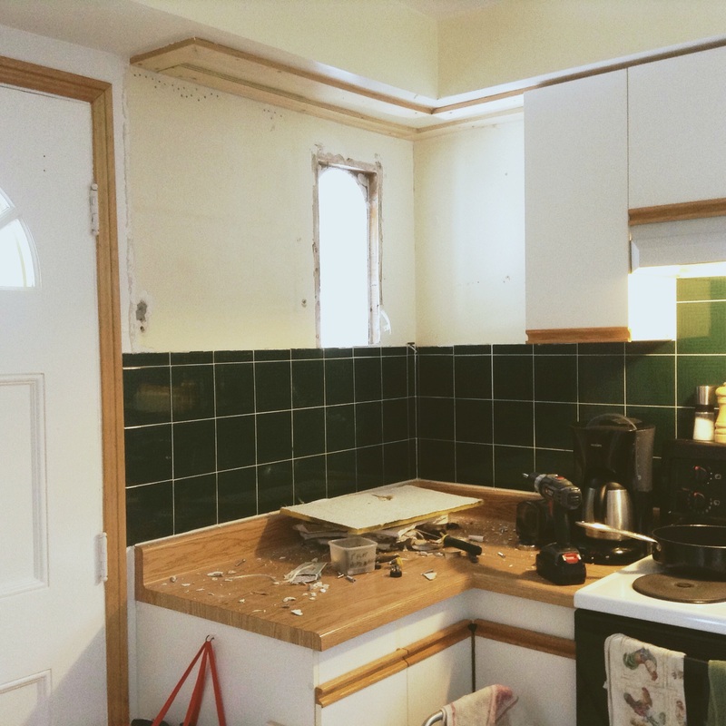 . . . Ahhhhhh (cue the singing angels). There it is. My window.
See the ceiling tile? Heh, heh. The window is in good shape. We need to tidy up the framing, but otherwise, it is better than I could have hoped for. I'm so thrilled to have this source of light freed up to brighten my kitchen. As you can see, the walls need some work, so I have had to spend a little money for some spackle. I have also had to shell out for some spray foam to seal a big gap - previously covered by the pantry cabinet - between the wall and the trim on the left side of the front door. So, here's what I've spent so far on my (almost) free kitchen update: The Almost Part $7.49 (spackle) + $4.59 (spray foam) $12.08 + tax $13.65 Next comes repairing and painting walls and dealing with the hideous backsplash. And I'll get to do it all while basking in the light from the front window. |
Jane Hogeterp Koopman

Subscribe to Jane's Blog by RSS or email:
Categories
All
Archives
January 2018
Stuff I love:
|
 RSS Feed
Proudly powered by Weebly